# Components
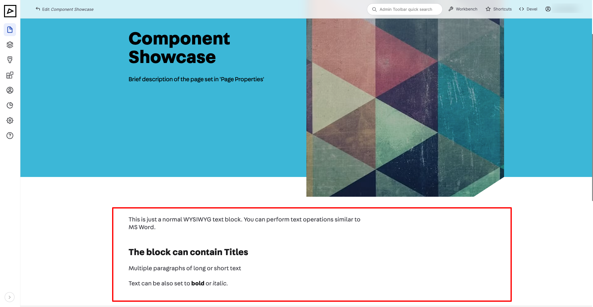
# Text
Use Text component for simple formatted text.
| Backend | Frontend |
|---|---|
 | |
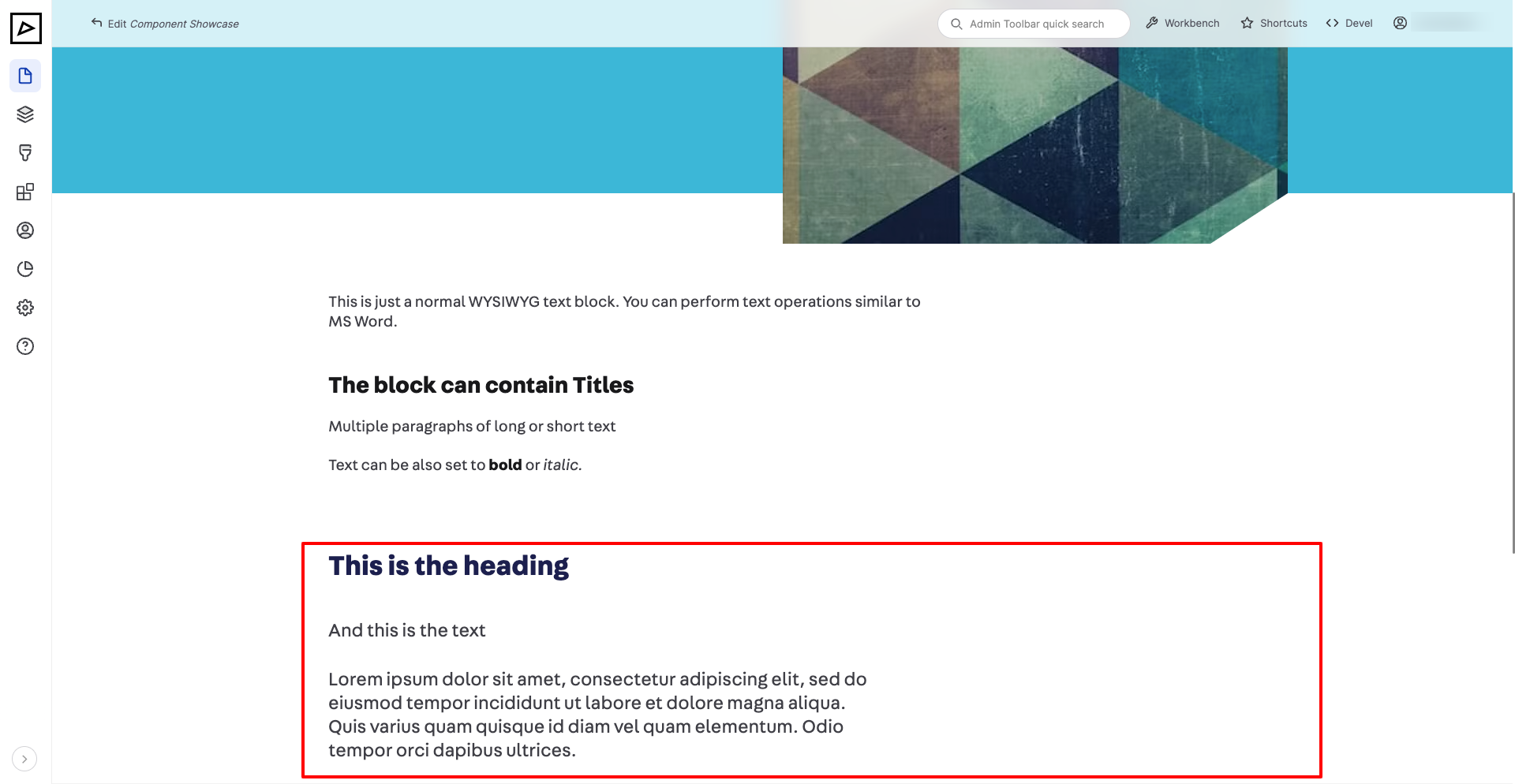
# Heading and Text
The difference between this component and Text is that Heading and Text has more uniform styles and generates semantic markup best for SEO.
Use this block where a heading is necessary, otherwise just Text is fine.
| Backend | Frontend |
|---|---|
 | |
# Image or Video
# Table
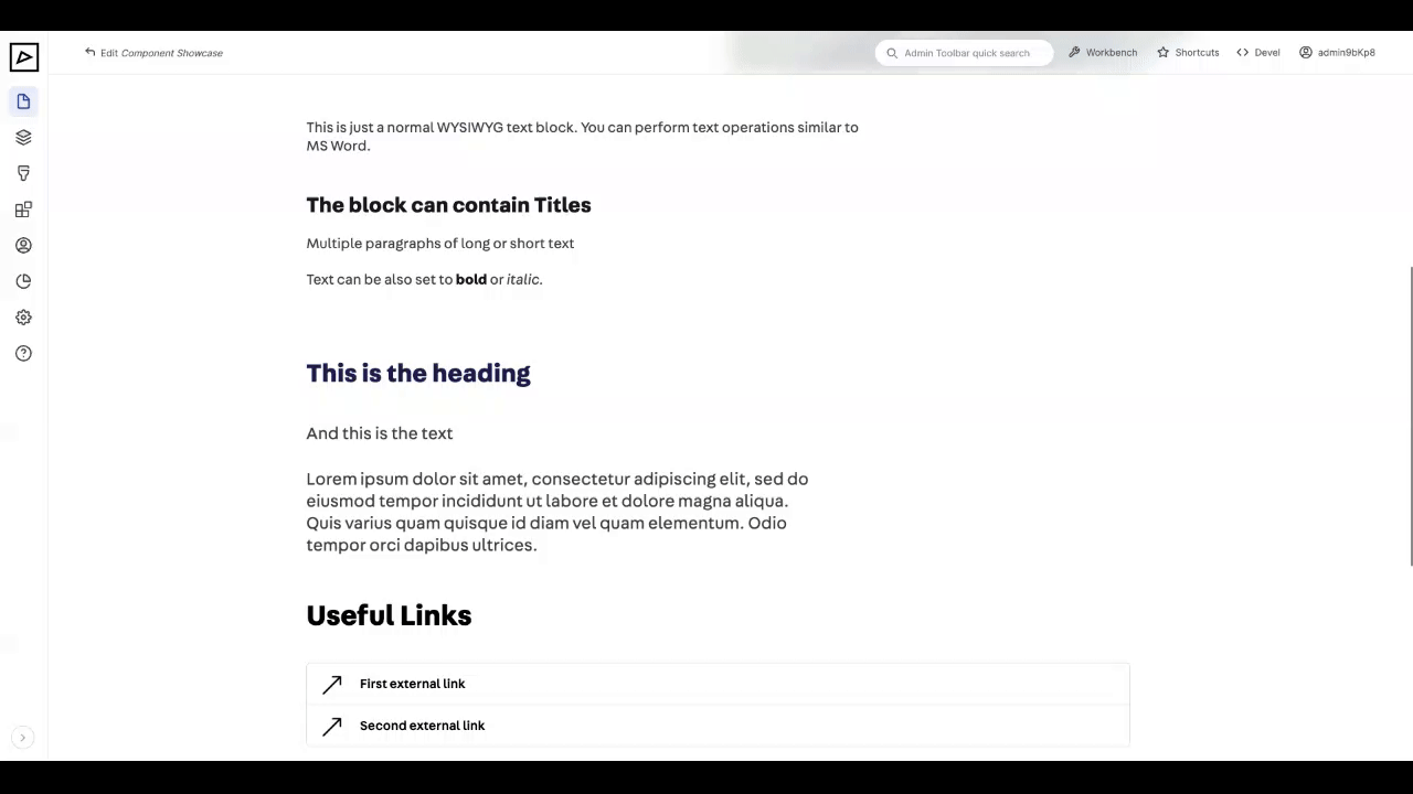
# Links
Used for linking to internal or external pages
| Backend | Frontend |
|---|---|
 | |
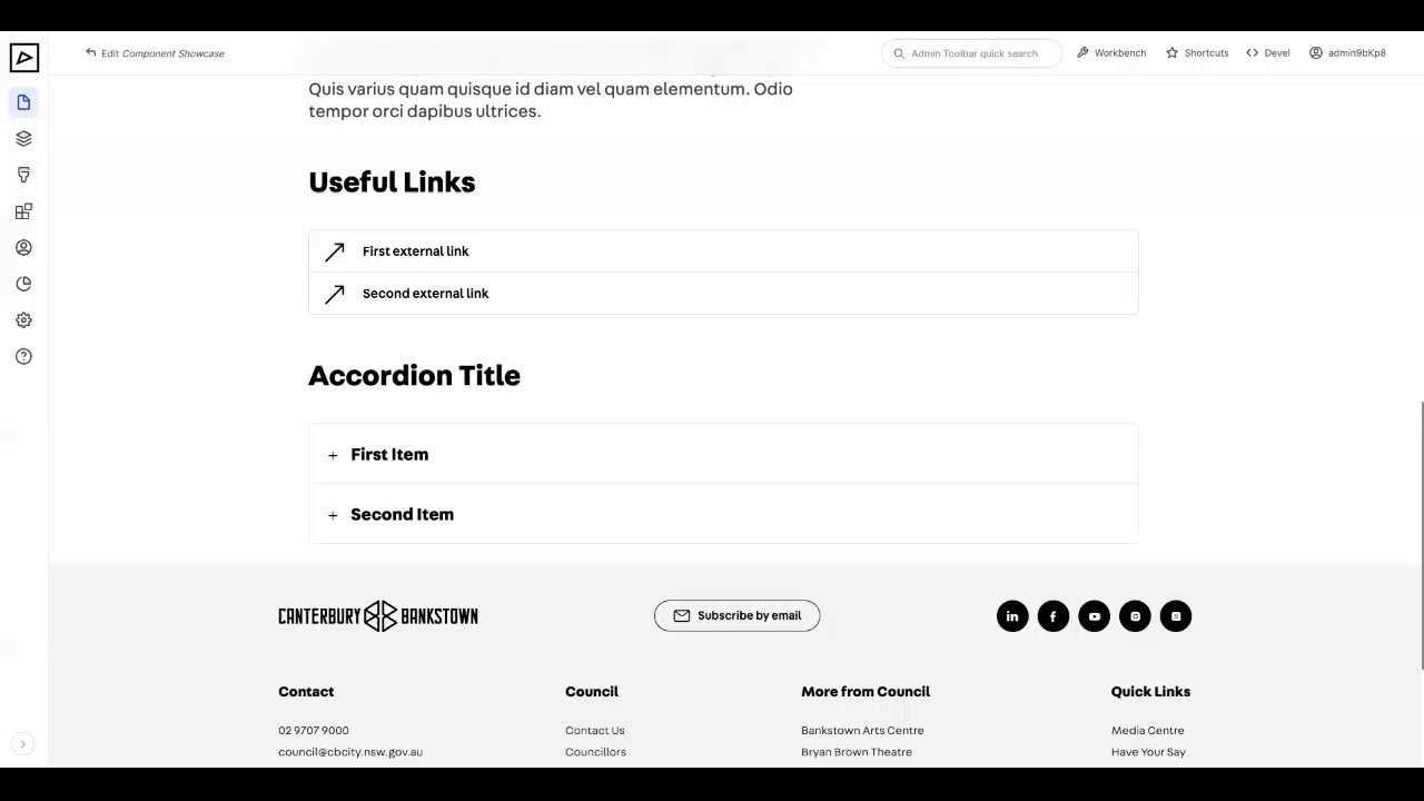
# Accordions
Used for displaying expand-collapse and timeline sections.
# Expand/Collapse
| Backend | Frontend |
|---|---|
 | |
# Timeline
| Backend | Frontend |
|---|---|
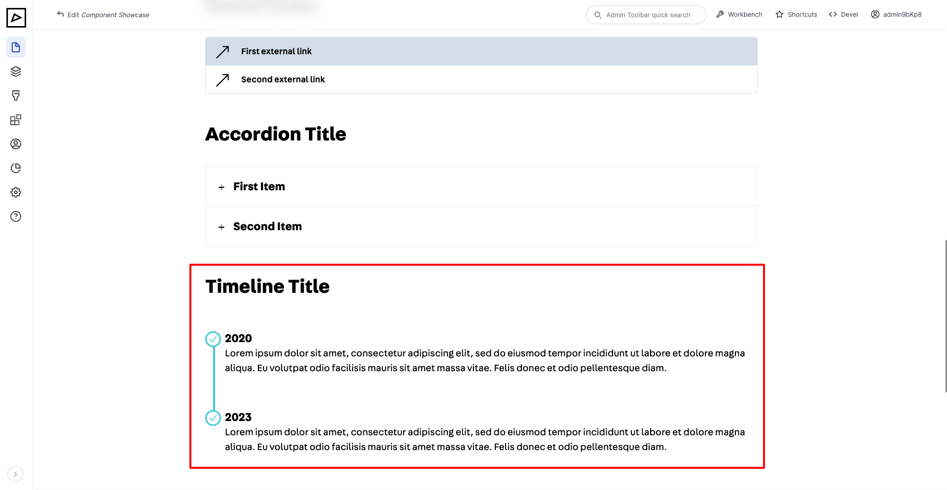 | |
# Documents
This component provides a way to link to internal documents such as PDFs.
| Backend | Frontend |
|---|---|
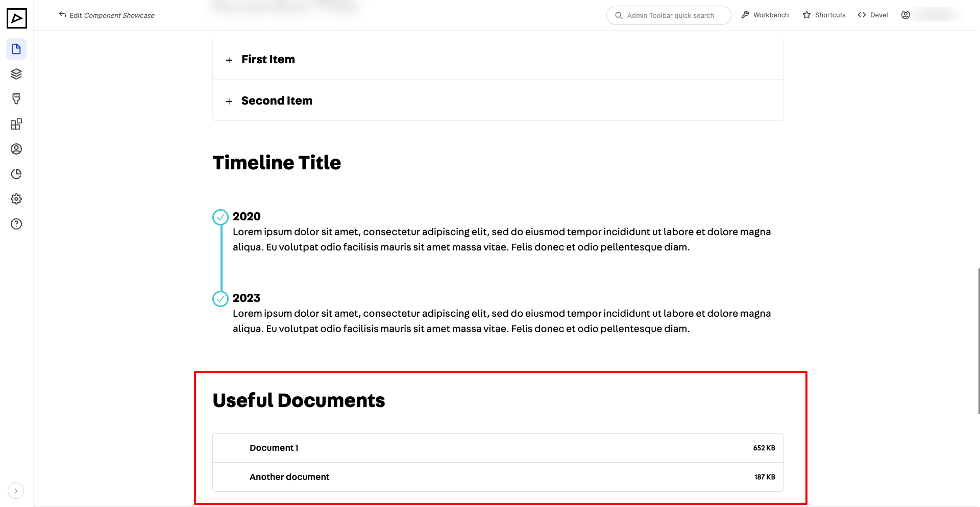 | |
# Contact Details
# Stepped Process
Typical use cases are to summarise steps of permit applications or phases of a city project.
# Horizontal
| Backend | Frontend |
|---|---|
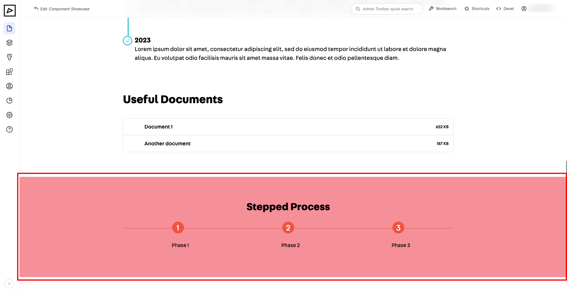 | |
# Vertical (Bullet Points)
| Backend | Frontend |
|---|---|
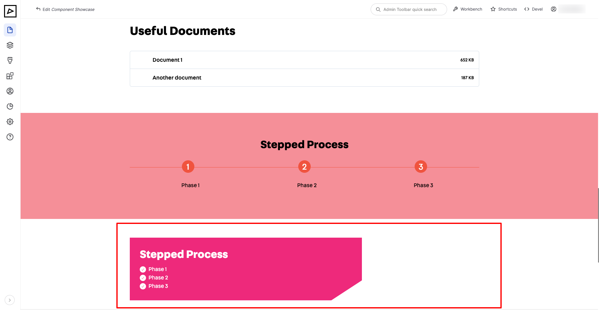 | |
# Carousel or Light Box
# Location
# Call to Action
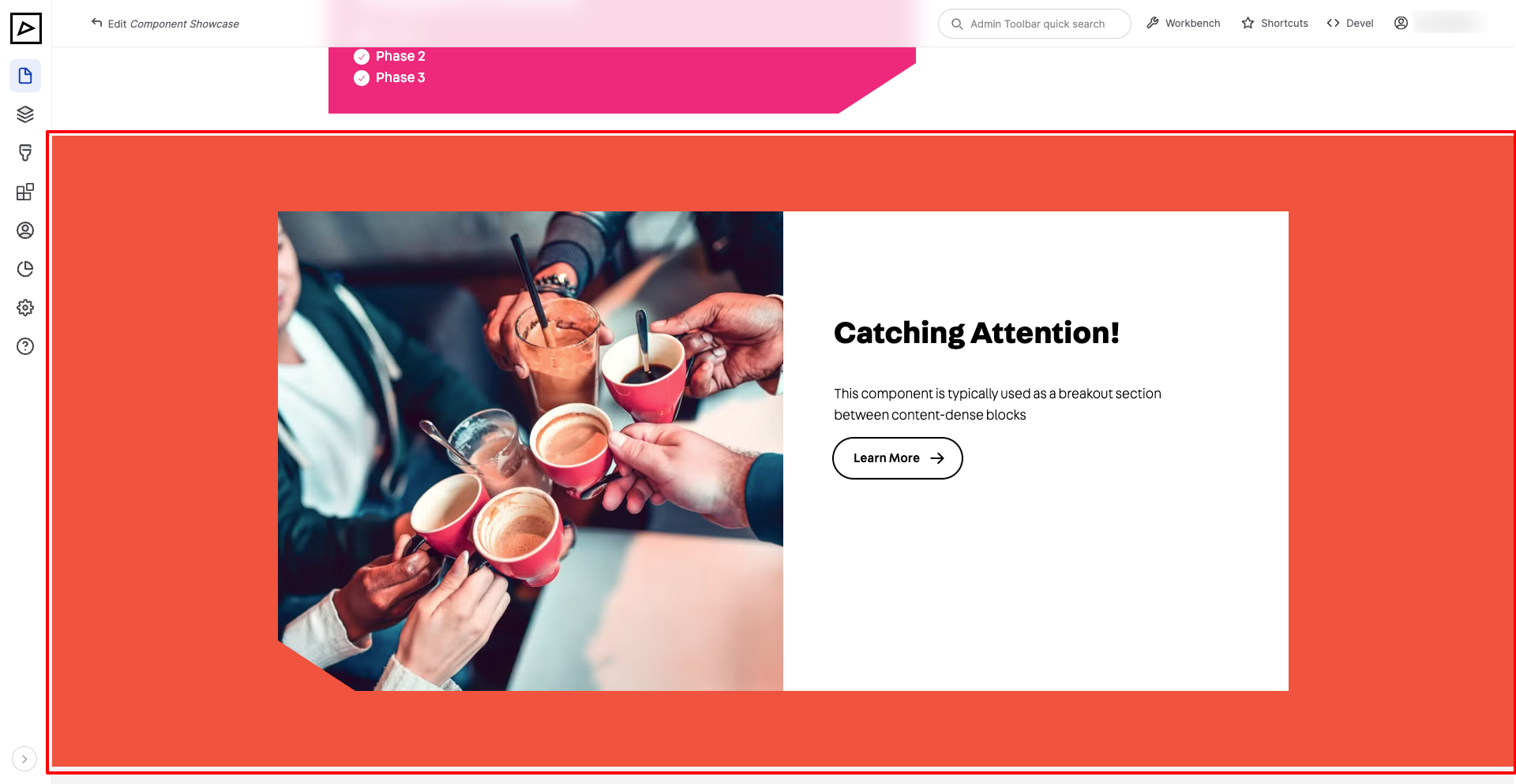
# Featured Item
This component is typically used as a breakout section between content-dense blocks
| Backend | Frontend |
|---|---|
 | |
# Special Content
This is reserved for developers to display highly custom content blocks
# Opening Hours
# Related Content
This component provides a way to link multiple internal pieces of content that will be displayed as a carousel (slider).
| Backend | Frontend |
|---|---|
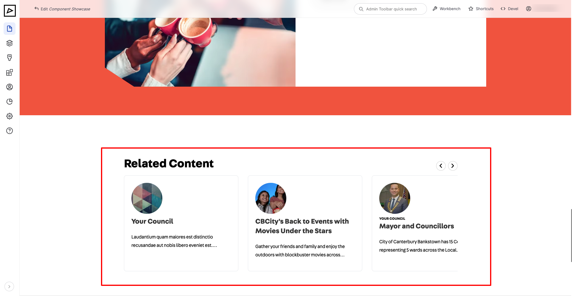 | |
TIP
For best display please make sure that attached pieces of content have summary and image set in Page Properties section.